Fundraise Video
Take home assignment
This project was a take home assignment while I was pursing the role of founding designer at Nsave.
Every company announces their series A investment.
It could look like a small pill on their website, it could look like a heavily worded Linkedin post or some decent companies might even go the distance of creating a static graphic with the $4M written out in bold.
In my opinion that’s a missed opportunity for a company especially like nsave that operates in the financial sector & has a great story.
nsave is a fintech platform that provides multi-currency accounts.
Widely used in USD, GBP, and EUR, allowing professionals, particularly in emerging markets like Nigeria, Bangladesh, Egypt, and Pakistan, to receive payments, hold funds, and exchange currencies.
What would success look like to us
But what if we could do more?
What if our users felt that we were more than a company
What if our potential future hire felt attracted by our purpose rather than the round size
What if our users we’re able to experience a part of the product

Ellen Lupton, Design is Story telling
There's an age old frame work which breaks down a story into a five quick portions. They are exposition, rising action, climax, falling action and denouncement.
Overall construct
The script revolves around setting context to how the hardest of workers already have quiet a lot on their hands & minds. As a company that focuses on enabling people with the best of the finance world we “Make Money Simple” for them.


Overview
You can find the story board and look through it in detail in the link attached below. Keep in mind that the attached image and so are purely for reference.
Hook, The Exposition

Money, just like sex, gathers everyones attention even if whispered slightly. It’s one of those things that affects people on multiple parts of their Maslow’s hierarchy of needs. Hence it makes sense to use the very word “Money” make the video intrinsically thumb stopping.
Over the last couple of months/years we have observed a certain type of hook to videos that has really been working to hijack the super shot attention span of today’s internet. It’s called the Flash Cut.

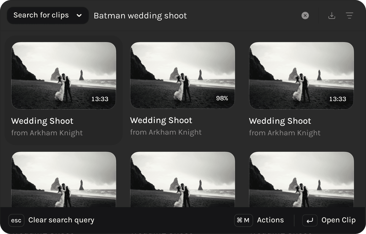
Having No Results
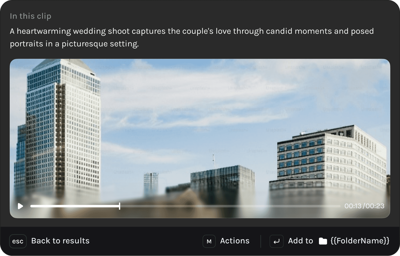
One of the trickiest bridges to cross with AI is hallucination. When you search a query our AI models will find you anything and everything that comes close to your query.
For most search queries, A 93% match would rank 1st on the list and a 92% match would rank 2nd, which is exactly how you’d like it to behave.
But for some queries, a 20% match to your query is still considered a Rank 1 result since there’s nothing better to find. But humans don’t like that result and would rather be told that there’s no match.
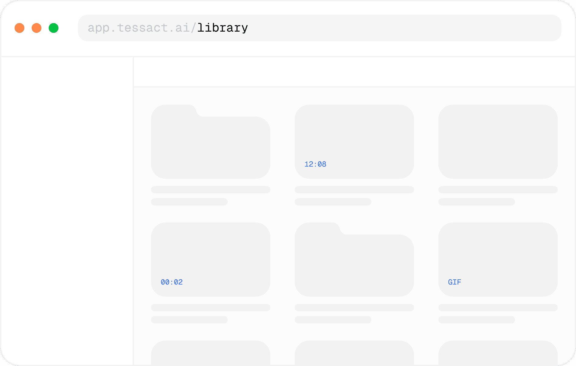
Contextual Addition to File Zones
Accommodating File Types
There’s a level of tolerable file types that any platform has to support. This is purely self implicated work to make your users feel comfortable. As a video platform we need to accomodate way more than just videos.
There could a background music track or an entire movie script, these kind of files make sense to be uploaded to Tessact, hence they are relevant to be searched through.
Custom-built for Power users
While we looked at PostHog to understand how our users went about navigating Tessact, it became evident that some of our users took certain actions repeatedly, multiple times a day. We built a few hidden capabilities that made users feel more in control.
Creating Folders & Projects
Enabling users to type out commands for the most commonly used creation flows reduced our interaction cost in multiple key user flows enabling users to invest more time in our product, in turn improving retention rates
Updating status of a project
Speed acting on crucial steps in their content collaboration flows tends to shave off some seconds per project.
For a team, that has 400 projects per day, with an average of 6 steps per project, this equates to saving 2 whole days per month.

Navigating across Tessact
When you’re building a product as complex as Tessact a lot of features, pages & parts of the product are nested, enabling a user to type a page name and get them there is invaluable.
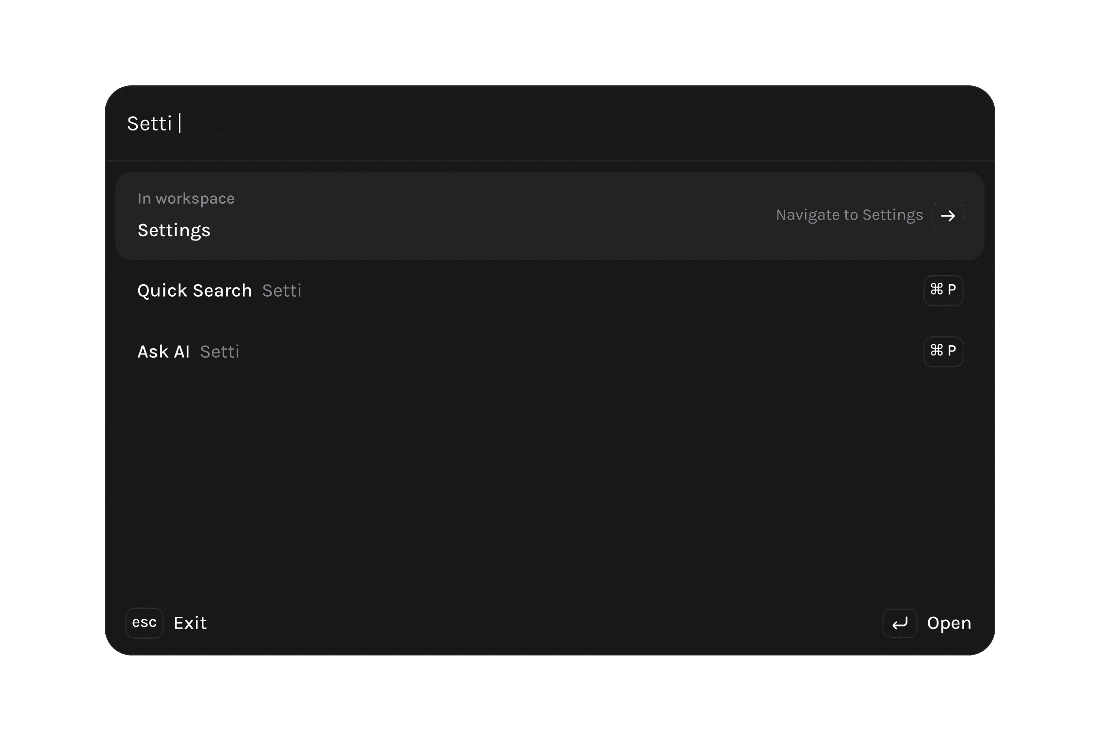
Return routes
But navigating without actually going step by step involves not knowing how to get back to where you came from, what if we remembered routes so that you can always teleport back without worrying.

In-product bug reporting
When our customers talk to us, we used to only hear from the point of contact or the higher ups, but we wanted everyone to feel like they could give us feedback.
Fire up cmd + k type out bug, report it and we’ll reach out with how we’ll fix your problem and when.

Acknowledgements
Developed by Unnati, Nitin & Rashad.
Inspired by Rauno’s component, Linear’s keyboard friendly UX and occasionally Raycast’s design principles, without none of which we’d have been able to cook this up.